

CSS3 animation 属性
实例
div{
animation:mymove 5s infinite;
-webkit-animation:mymove 5s infinite; /* Safari 和 Chrome */
}
animation: name duration timing-function delay iteration-count direction;
| 值 | 描述 |
|---|---|
| 规定需要绑定到选择器的 keyframe 名称。。 | |
| 规定完成动画所花费的时间,以秒或毫秒计。 | |
| 规定动画的速度曲线。 | |
| 规定在动画开始之前的延迟。 | |
| 规定动画应该播放的次数。 | |
| 规定是否应该轮流反向播放动画。 |
练习
只进行一次的动画
div {
   animation:mymove 5s 1;
   -webkit-animation:mymove 5s 1; /* Safari 和 Chrome */
}
以低速开始和结束的循环动画
div {
   animation:mymove 5s ease-in-out infinite;
   -webkit-animation:mymove 5s ease-in-out infinite; /* Safari 和 Chrome */
}
来回摆动的循环动画
<!DOCTYPE html>
<html>
<head>
<style>
.box{
    width: 348px;
    height: 129px;
    border-bottom: 1px #ccc inset;
    border-left: 1px #ccc inset;
    border-right: 1px #ccc inset;
}
#div1{
    width:50px;
    height:50px;
    background:#422727;
    border-radius: 50%;
    position:relative;
    animation:mymove 5s cubic-bezier(0.8,0.8,1,1)   infinite alternate;
    -webkit-animation:mymove 5s cubic-bezier(0.8,0.8,1,1)   infinite alternate; /*Safari 和 Chrome */
}
@keyframes mymove{
    0% {left:0px;top:0px;}
    30%{left:75px;top:50px;}
    45%{left:140px;top:75px;}
    50%{left:150px;top:80px;}
    55%{left:160px;top:75px;}
    70%{left:225px;top:50px;}
    100% {left:300px;top:0px;}
}
@-webkit-keyframes mymove /* Safari and Chrome */{
    0% {left:0px;top:0px;}
    30%{left:75px;top:50px;}
    45%{left:140px;top:75px;}
    50%{left:150px;top:80px;}
    55%{left:160px;top:75px;}
    70%{left:225px;top:50px;}
    100% {left:300px;top:0px;}
}
</style>
</head>
<body>
<div class="box">
    <div id="div1"></div>
</div>
</body>
</html>
进阶
cubic-bezier(x1,y1,x2,y2)的使用方法
ubic-bezier() 函数定义了一个贝塞尔曲线(Cubic Bezier)。
贝塞尔曲线曲线由四个点 P0,P1,P2 和 P3 定义。P0 和 P3 是曲线的起点和终点。P0是(0,0)并且表示初始时间和初始状态,P3是(1,1)并且表示最终时间和最终状态。
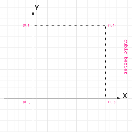

从上图我们需要知道的是 cubic-bezier 的取值范围:
P0:默认值 (0, 0)

P1:动态取值 (x1, y1)

P2:动态取值 (x2, y2)

P3:默认值 (1, 1)
我们需要关注的是 P1 和 P2 两点的取值,而其中 X 轴的取值范围是 0 到 1,当取值超出范围时 cubic-bezier 将失效;Y 轴的取值没有规定,当然也毋须过大。
最直接的理解是,将以一条直线放在范围只有 1 的坐标轴中,并从中间拿出两个点来拉扯(X 轴的取值区间是 [0, 1],Y 轴任意),最后形成的曲线就是动画的速度曲线。
来尝试一下
<!DOCTYPE html>
<html>
<head>
<style>
div{
   width:100px;
   height:50px;
   background:red;
   color:white;
   font-weight:bold;
   position:relative;
   animation:mymove 5s infinite;
   -webkit-animation:mymove 5s infinite; /* Safari and Chrome */
}
#div1 {animation-timing-function:cubic-bezier(0,0,1,1);}
#div2 {animation-timing-function:cubic-bezier(0.25,0.1,0.25,1);}
#div3 {animation-timing-function:cubic-bezier(0.42,0,1,1);}
#div4 {animation-timing-function:cubic-bezier(0,0,0.58,1);}
#div5 {animation-timing-function:cubic-bezier(0.42,0,0.58,1);}
/* Safari and Chrome: */
#div1 {-webkit-animation-timing-function:cubic-bezier(0,0,1,1);}
#div2 {-webkit-animation-timing-function:cubic-bezier(0.25,0.1,0.25,1);}
#div3 {-webkit-animation-timing-function:cubic-bezier(0.42,0,1,1);}
#div4 {-webkit-animation-timing-function:cubic-bezier(0,0,0.58,1);}
#div5 {-webkit-animation-timing-function:cubic-bezier(0.42,0,0.58,1);}
@keyframes mymove{
   from {left:0px;}
   to {left:300px;}
}
@-webkit-keyframes mymove /* Safari and Chrome */{
   from {left:0px;}
   to {left:300px;}
}
</style>
</head>
<body>
   <p><strong>注释:</strong>Internet Explorer 9 以及更早的版本不支持 animation-timing-function 属性。</p>
   <div id="div1">1</div>
   <div id="div2">2</div>
   <div id="div3">3</div>
   <div id="div4">4</div>
   <div id="div5">5</div>
</body>
</html>
Comments | NOTHING